


Over the last decade professional squash has gone through several changes in an attempt to promote the game across the globe and increase viewership among spectators. A major component of this endeavor has been the development of SquashTV, which provides high-quality streaming video coverage for professional squash. The channel provides access to match analysis, live streams, exclusive interviews, highlights of tournaments and much more. In this blog we investigate the popularity of SquashTV on YouTube. Perhaps this is a good method to analyze the increase in popularity of squash among the general public rather than among the aficionados who subscribe to SquashTV. Roughly a year ago (in January 2019), SquashTV reached a considerable milestone by surpassing 100 million views on YouTube totalling 9,700,00 hours (11,106 years) of squash. The following blog contains some statistical analysis of how SquashTV grew on YouTube from March 2017 to January 2020. For further reading on SquashTV there are linked articles at the end of this blog.
We will quantify the success of SquashTV using three main parameters, namely, the number of subscribers, the number of video posts, and the number of video views. These parameters can be defined as follows:
- Subscriber: Someone who has chosen to ‘subscribe’ the SquashTV YouTube channel in order to stay updated with the latest content.
- Video Posts: This is the number of videos posted by SquashTV on their YouTube channel
- Video Views: These are the number of video views SquashTV has acquired. Note it does not distinguish which videos received the views but rather an accumulation of video views
Subscribers, Videos, and Views as a Function of Time
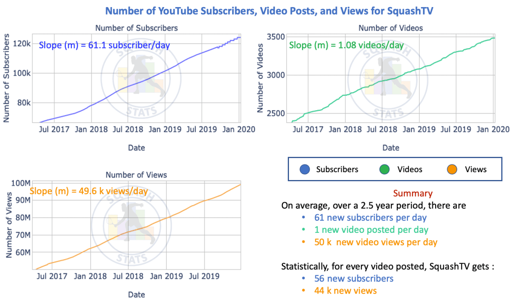
As can be seen from the plots below, the accumulation of total number of subscribers, the total number of views and the total number of videos posted, follow the similar linear trend. One can fit linear lines to the data and the slopes of these lines, which are annotated in each graph, provide us with information about the rate of increase of that particular parameter. From the slopes we can tell that the SquashTV YouTube channel grows, on average, by ~61 new subscribers per day, posts a little more than one video per As can be seen from the plots below, the accumulation of total number of subscribers, the total number of views and the total number of videos posted, follow the similar linear trend. One can fit linear lines to the data and the slopes of these lines, which are annotated in each graph, provide us with information about the rate of increase of that particular parameter. From the slopes we can tell that the SquashTV YouTube channel grows, on average, by ~61 new subscribers per day, posts a little more than one video per day on average, and gets ~50k views per day (more precise numbers are provided on the plots below). This essentially means that on average for every video posted by SquashTV on their YouTube channel, they get 56 new subscribers, and 44 thousand new views. We can also use the slopes to calculate a projection for the future. Assuming the parameters continue on the same trend, we calculate that in 2025 SquashTV will have 250k subscribers, 5.5k videos and 152 million views on YouTube. However, recently it is evident that SquashTV is generating more content such as player interviews, the “It’s Mine” campaign, and “Beyond the Glass” and therefore this may impact the trend.
To facilitate presentation and illustration, from this point on we will only consider data within a 12 month period of time. This time interval will be September 2018 to August 2019 inclusive thus including the entire 2018 – 2019 season.
New Subscribers, Videos, and Views per Day Over a Single Season
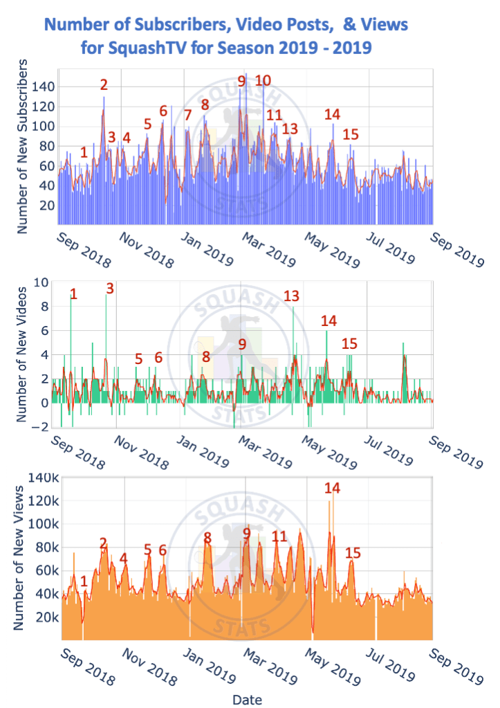
This aforementioned season is depicted in the graphs below, where each individual spike represents a single day and its amplitudes represent the number of new subscribers, videos posts and number of views for that given day. Superimposed on each graph is a smoothed red line (smoothed using moving averages technique, where every data point is averaged over the previous three days) in order to make the data trend a little more clear. In each graph one can see that there are time-consistent spikes which are numbered. These numbers can be cross referenced with the table below the graphs where information regarding which tournament was being played at the time can be viewed in addition to which genders play in this tournament. The other data in this table will be explained later in this section. All the peak numbers are shown in the subscribers graph but some of the numbers are purposefully missing in the other graphs (i.e. videos and views) for aesthetic reasons. From all these graphs one can deduce which peaks in the graph correspond to which tournaments.
Upon close inspection of the number of videos posted, one can also see that there are some negative values. This is possibly due to some videos being removed. For analysis on this section these negative values are ignored. It can be seen that there is a slow start to the season with a low viewership in the Oracle NetSuite Open (#1). Perhaps this is due to lack of awareness of fans that the season has commenced. Clearly there are peaks in the number of videos posted for most tournaments resulting in peaks in both the subscribers and videos viewed charts. There is a decrease in the number of new subscribers and video views in the time period between the tournaments and during the off season due to fewer tournament videos being posted. Having said that, the aforementioned parameters remain at the considerable level of about 45k views per day and 55 subscribers per day in the off-season during the tournament intervals. This may well be due to the additional content posed by SquashTV, such as shot of the month, tournament summaries, player interview etc.
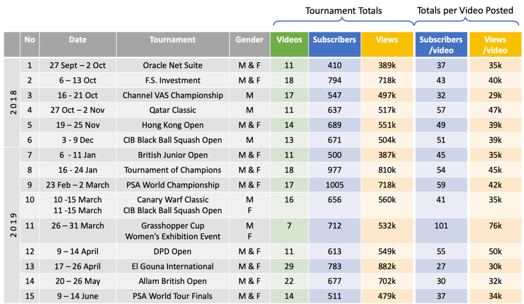
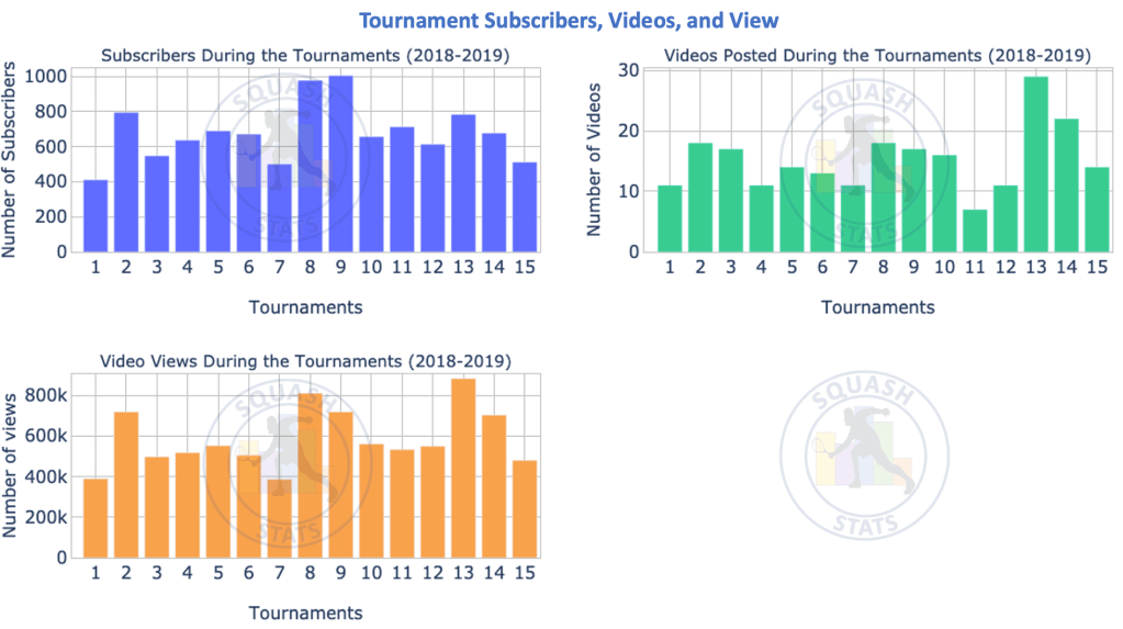
The above plots show how the parameters vary on a day-to-day basis. The above table (left hand side) provides us with the dates of each tournament. Thus by combining these pieces of information we can determine the number of subscribers, video views and video posts that occurred during the time period of each tournament. The resulting information is shown in the above table under the ‘Tournament Totals’ columns and is illustrated in the bar charts below whereby the number on the x-axis can be used to reference a specific tournament on the above table. From the graphs it can be seen that the Tournament of Champions (#8) and PSA World Championship (#9) drew the greatest number of new subscribers with approximately 1,000 each for the entire tournament. These two tournaments also received a high number of views with only the ‘El Gouna International Open’ (#13) getting more views. However, the ‘El Gouna International Squash Open’ (#13) also had the most videos posted (29) so it is not all too surprising that it too has the most number of views. To normalise the effect of having a large number of videos posted, we can instead look at the number of subscribers and video views of a tournament as a function of the videos posted. This data is also presented in the above table under the section entitled ‘Totals per Video Posted’. Surprisingly it is the Grasshopper Cup (#11) that substantially outperforms the other tournaments in terms of subscribers and video views per video posted. This seems to be due to a low number of videos posted and yet it maintains a good viewership and subscription rate. It should be noted that there was also a ‘Womens Exhibition Event’ at the Grasshopper cup which received a lot of new subscribers and video views. Of course these results are a crude approximation due to the fact that other videos may have been posted during this time, other tournaments may be simultaneously taking place with video posts, but we have tried to mitigate such errors as much as possible.
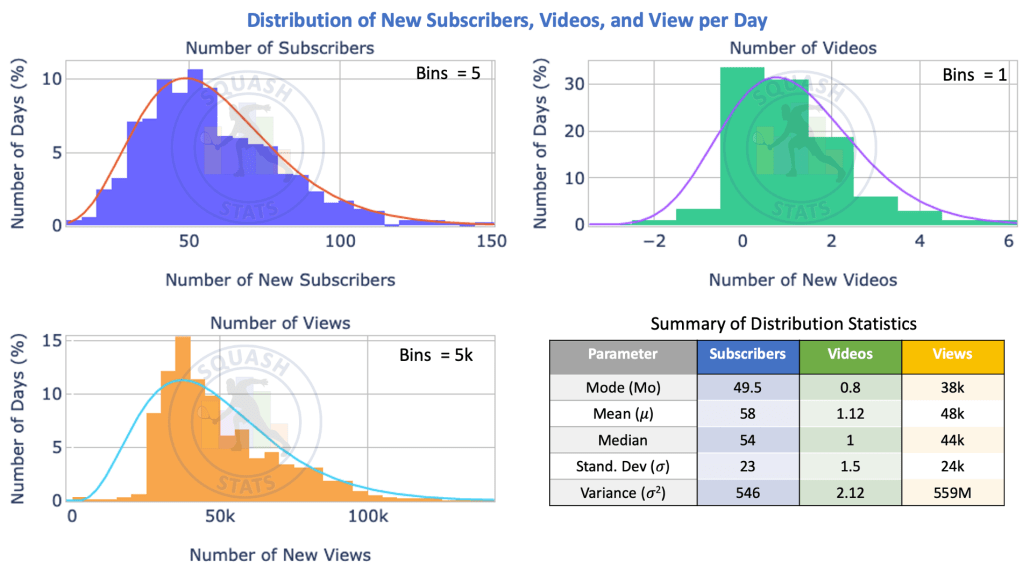
The Distribution of Subscribers, Videos, and Views per Day
In the first section, by observing the accumulated sum of each parameter In the first section, by observing the accumulated sum of each parameter and fitting a linear line to each parameter, graphs we were able to deduce the statistical average number of subscribers (61), video posts (1), and views (51k) per day. However, from the graphs in the previous section one can see that the numbers per day vary a lot. For example, there are some days when there will be 50 subscribers, and other days when there will be 70 subscribers. The same concept can be applied for the video posts, and video views. To gain a better understanding we therefore need to look at the distribution of these parameters per day. The plots below provide the distribution of each parameter per day as a percentage of the total parameter gained over the one year period. A statistical summary of the plots are also provided in the bottom right. The following are some basic statistical definitions to aid in fully understanding the graphs:
- Mode: is the most common number
- Mean: is the sum of all the data divided by the number of data items (i.e. the average)
- Median: is the middle number in the data when ordered numerically
- Standard Deviation: is how much the data differs from the mean of the data
- Gamma Distribution: a specific type of distribution function.
In order to display the graphs below, the data has been split into intervals In order to display the graphs below, the data has been split into intervals known as bins. If one considers the distribution of new subscribers (top left), it uses a binning of 5. This means that each bar represents an interval of 5 new subscribers. Therefore, if we examine the distribution close to the peak, we can say that there are 50 – 55 new subscribers 10.5% of the days. In these graphs the mode, mean and the standard deviation are the most useful attributes. The data is fitted to a gamma distribution which is shown by the full line on each graph. The gamma distribution itself is used in engineering, science, and business to model continuous variables that have a skewed (lopsided) distribution as is the case here.
From the graph describing the number of videos posted per day we can conclude that on ~33% of the days no videos are posted and another 31% of the days one video is posted. As one continues to increase the number of videos the percentage of days decreases substantially. One can again see that there are some negative values, which we have already noted above to be due to some videos being removed.
An interesting note on the distribution involving the number of views below is that there is a noticeable discrepancy between the gamma distribution (cyan line) and the data (orange bars) in the 0k – 25k range. This effect can also be seen in the above section (graph of number of viewers per day) where the level of viewership rarely decreases below 30k new views per day, even in the off season. Essentially this means that for almost all days, there are over 25k views. Therefore one expects to have a lower percentage of data in this range of the distribution curve.
Comparison of Parameters During Tournament & Non-Tournament Days
The above plot shows the distribution of subscribers, videos, and views over the 1 year time period previously defined. However, we can also divide this data into two distinct categories:
- Tournament Days (TD): which we define as the days during a PSA broadcasted tournaments. We also include 2 days after the end of the tournament due to the fact that the finals are posted on the SquashTV YouTube channel the next day and the viewership for the following day again is affected by this posting. The dates for the TD’s can be viewed from the table in a previous section.
- Non-Tournament Days (NTD): which we define as the days when there is no tournament coverage by PSA SquashTV. This is essentially all days that are not TD’s
By dividing the data into these two categories we can determine the specific behavior, or more precisely the difference in behaviour, of subscribers and viewers on TD compared to NTD’s. Some basic statistical analysis reveals that 63% of the days are NTD’s (229 days of the year) and 37% of the days are TD’s (136 days of the year). The plots below are similar to the distribution plots above except that here that data is split into the two aforementioned categories. Each plot is annotated and colour coded to indicate which plots (TD or NTD) represent which dataset. On the bottom right there is also a table which provides essential statistical analysis on both sets of data. In each case of the subplots the lighter colour shade represents the non-tournament days (NTD) while the darker colour represents data from the tournament days (TD). The x-axis gives the magnitude of the parameter and y-axis provides the percentage of the total data in which this magnitude occurred.
In all graphs one can see that the TD plots are always shifted to the right. This is also reflected in the table where the mean, mode and median are all higher for the TD plots. If we look specifically at the mode values, which is where the peak occurs, we can see that the NTD’s has 49 subscribers per day, 0.5 videos posted per day and 38k new videos views per day. This is in direct contrast to TD which has (in terms of mode values) 71 subscribers per day, 1.2 videos posted, and 61k views per day. This essentially reinforced what we expect, that the TD’s have higher values of subscribers, videos posts and video views.
The standard deviation of each distribution is a measure of the width of the distribution. One can see by comparing the standard deviations of the TD’s and the NTD’s that the TD always has a larger distribution, or more simply, a larger spread of values.
One can also see that there is a consistent difference in amplitude which is due to the percentage of the full data represented by the that category (i.e. TD = 37% and NTD = 73%). In fact the summation of both data sets per binning interval will give you the total distribution as is shown in the previous section. Similar comparisons can be made with the mean and median parameters on the table.
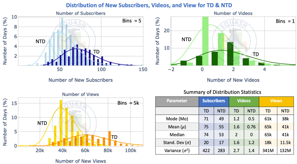
The accuracy of the above graphs is not clear as the TDs only take into account the PSA World Tour tournaments. It does not take into account tournaments such as Junior Championships and World Team Squash Championships, which are often live streamed and receive a high viewership. Having said that, all the major spikes in subscribers and viewers graphs when depicting the daily parameters have been accounted for by PSA World Tour tournaments.
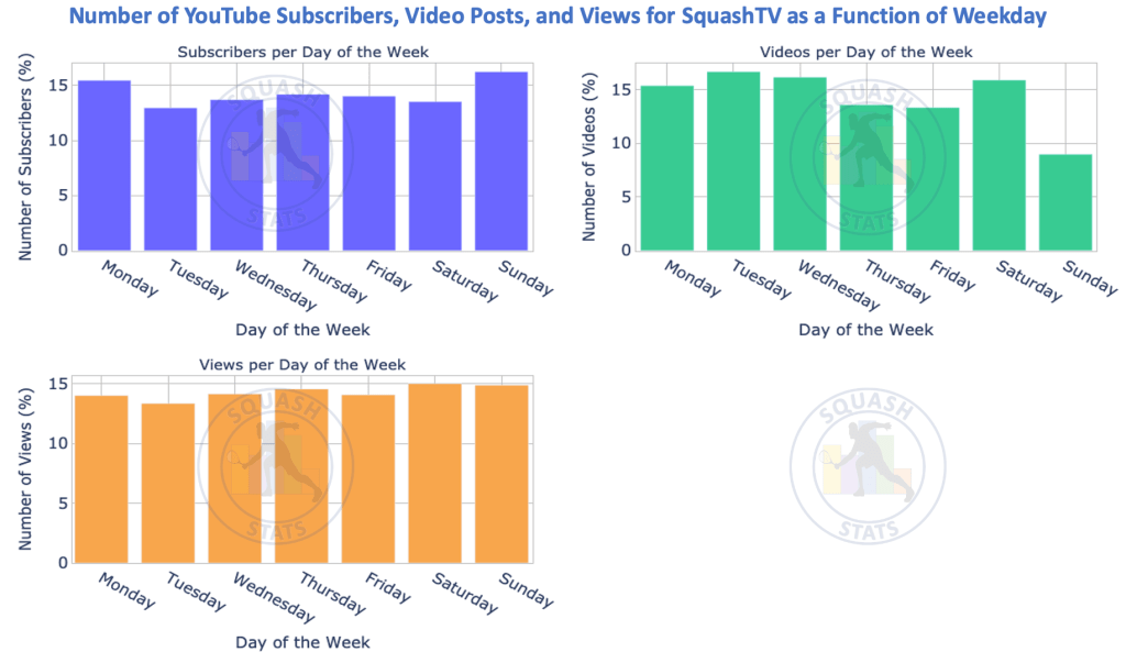
New Subscribers, Videos, and Views as a Function of Days of the Week
The below graph investigates whether the number of subscribers, video posts, and views vary depending on the day of the week. This data is representative of the 2018 – 2019 season as is previously defined. One can clearly see that the number of videos posted on Sundays is much less than the other days. On average 8% of the videos are posted on a Sunday whereas, on average, 13% of the videos are posted each of the days in the rest of the week. This effect is not observed in the viewership or the number of new subscribers. In fact there is no discernible trend regarding viewership and subscribers indicating that the YouTube channel has no day preference for these parameters which average at approximately 14 % per day.
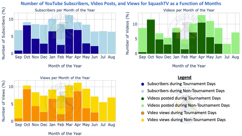
New Subscribers, Videos, and Views as a Function of Months of the Year
The below graphs explore the parameters as a function of months of the year. The data is again split into the parameter during the TDs and NTDs. This split in data is indicated in each graph with the aid of a colour code which is illustrated in the legend. In general the darker colour is for the TDs and the lighter is for the NTDs. The variation between the TDs and the NTDs for all parameters can be clearly seen. October, January, March and April see the largest parameters, and one can also see that during these months there is a large proportion of these parameters from tournament days. For the off-season, which we define as July and August, one can see that there are no tournament day parameters (darker colour) but rather the bar is full of NTD’s (lighter colour).
Article in a Nutshell
- The subscribers, videos posts, and number of views of the SquashTV YouTube channel are increasing linearly at a rate of 61 subscribers, 1 video post, 50k views per day respectively
- According to linear projections, in the year 2025 the SquashTV YouTube channel will have 250k subscribers, 5.5k video posts and 152 million views.
- Both viewership and new subscribers spike during tournament days compared to non tournament days.
- The Tournament of Champions and the PSA World Championships recorded the highest viewership of the season on SquashTV’s YouTube channel.
- The Grasshopper Cup recorded the most views per videos posted.
- The tournament days (TD) data accounts for 37% of the data and the remaining 73% of the data is for non-tournament days.
- The number of subscribers, videos posted and video views per day of the week is roughly constant except for Sunday which sees a lower number of videos posted.
Other Articles on SquashTV
- Serious Squash: Why we should all purchase a SquashTV membership
- Inside the Game: PSA SquashTV reaches 100,000 YouTube Subscribers
- Broadcast Now: SquashTV to broadcast men’s squash championship live to 3M global fans
Data Sources
The following are the details of the data used in this article
| Parameter | Description |
| Source | https://www.trackalytics.com/ |
| Start Date | 27-March-2017 |
| End Date | 09-January-2020 |

One comment